Old Advertising Images from Postal Items (3)

As soon as envelopes were used for sending business letters and advertisements in the mid-19th century, it was quickly realized that the envelope (cover) itself could be an advertisement; the potential customer could be influenced before they even tore open the envelope. Even if someone did not see the contents, they saw the logo and image.
When postal cards were created later in that century, businesses found them very useful for advertisements (and they only cost a penny). The images on postal items from around the turn of the 20th century are very collectable. I hope that this group (3 of 4) of such images provides a window into those times far gone. Many of the advertising images are examples of the finest art of the engraver and illustrator.
If you are interested in collecting advertising covers, be sure to check out Jim Forte's postal history search page. Just search for 'advertising'.
(Legal Stuff) These images are provided for educational and research purposes ONLY. If you use them for anything commercial, you are on your own. Some of the images here, although scanned from items over 100 years old, may STILL be COPYRIGHT or TRADEMARK for the companies that use them. In some cases, the companies may STILL be using them in 2020. You have been warned.
CLICK ON THE THUMBNAIL IMAGES TO VIEW A LARGER IMAGE
![[Classic American Indian Image <!-- Wed 22 Jul 2020 02:22:48 PM CDT created this is a comment top line only -->]](http://swansonphotos.com/thumbs/adverts/indian.jpg)
![[Art Nouveau Design for Steel Company]](http://swansonphotos.com/thumbs/adverts/jessop_steel_logo.jpg)
![[Overall Advertisement for Palo Alto]](http://swansonphotos.com/thumbs/adverts/palo_alto_ad.jpg)
![[Ornate Peacock Design]](http://swansonphotos.com/thumbs/adverts/peacock.jpg)
![[Quaker Oats Man]](http://swansonphotos.com/thumbs/adverts/quaker_oats.jpg)
![[Ornate Military-Themed Logo]](http://swansonphotos.com/thumbs/adverts/shield.jpg)

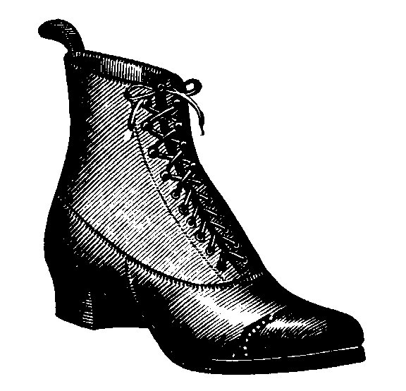
![[Dress Shoes from Illustrated Postal Card]](http://swansonphotos.com/thumbs/adverts/shoe.jpg)
![[Back of Postal Card with Huge List of Items for Sale]](http://swansonphotos.com/thumbs/adverts/things_for_sale.jpg)
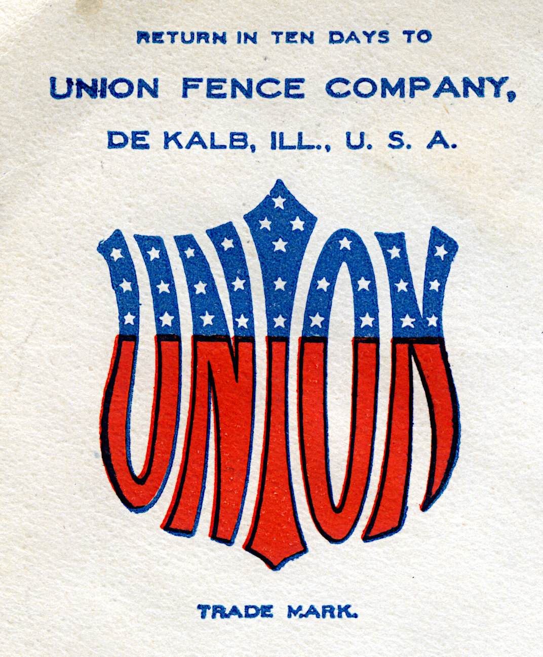
![[Union Fence Logo on Cornercard]](http://swansonphotos.com/thumbs/adverts/union_fence.jpg)
![[Logo of the Seawanhaka Corinthian Yacht Club]](http://swansonphotos.com/thumbs/adverts/yacht_club.jpg)
![[Advertising Cover from a Raincoat Company]](http://swansonphotos.com/pics/parcel_post_usage2.jpg)
![[Ornate Cornercard of the Ammonol Chemical Company]](http://swansonphotos.com/pics/parcel_post_usage.jpg)
![[Advertising Cover with Prices of Paper Products]](http://swansonphotos.com/pics/pp_usage3a.jpg)
![['Merchandise' Usage of Parcel Post Stamp with Advertising Logo]](http://swansonphotos.com/pics/pp_usage4.jpg)
![[Paint Advertising]](http://swansonphotos.com/pics/paintcn2.jpg)