After Google started grading websites on the basis of their adapability to use on all devices, including phones, tablets, and the traditional web browser, many web developers attempted to create a system that would work well on all these devices. If the web pages passed the Google "tests", the pages would receive higher search engine ratings.
Google's new requirements brought out my own frustration with websites that depended on large complex computer screens. There are a LOT of such websites, and they often become unusable on phone displays.
During my many searches for better ways to lay out web pages, I found two systems that both worked well, were fairly simple to implement, and met Google's criteria. The page you are viewing was laid out using the system entitled the "Power of Em".
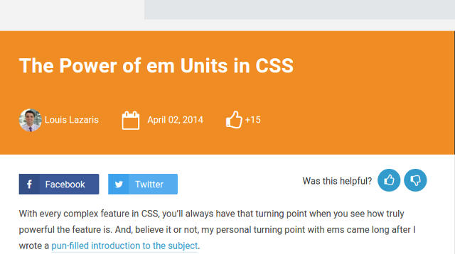
This system was created by Louis Lazaris. See the 'Power of Em' article he created. The original inspiration for this layout system came from this article on flexible CSS layouts.
I have found that the technical simplicity of this system is very helpful. In particular, I have adapted the font size alteration to fit within the narrow ranges normally set by users. Simply said, the user can alter the font size to fit their device by clicking on the buttons at the top of each screen. "Smaller" makes the type size smaller, down to what I consider unreadable. "Larger" makes the font size larger until a single word can easily fill the screen. "Default" returns the font size to a number suggested by the size of the viewers' screen. These controls allow the user to easily resize the information, when the original size "guess" is not quite right.
While this system does not completely resize the images on the page, they generally fit well inside the bounding box. This behavior is not always the case with other "flexible" webpage layout sytems.
The underlying technology is quite simple: by altering the "em" size of the base font, all other measurements of the web page are altered accordingly. Using Em's is especially beneficial, because other ways of sizing, such as millimeters, points, inches, all depend on the actual size of the viewers' screens. With new devices appearing almost daily, all with different display screen technology, it is very difficult to alter the web coding to accomodate them all.
Note that I have expanded on the original code, and allow the web creator to supply an optional link at the top of the page. I use this link to allow a jump to a "table of contents", which is quite useful on long pages with multiple sections. The TOC is usually placed at the bottom of the page.
Copyright © 2014-16 Robert Swanson. This code is being used not only on our personal web pages, but also for pro bono projects I perform for non-profit organizations. Web page designers may freely use this CSS and Javascript code, with the understanding that they should provide credit to Louis Lazaris. See article and the creator of the original inspiration.
Take a look at 'Skeleton', another way to create flexible web page layout on a large variety of devices.